Concrete is strange substance. Versatile certainly but in terms of its aesthetic beauty? Well, in that regard perhaps it falls short. After the Second World War, with much of Europe in ruins the opportunity to turn areas that were considered poor and run down were ripe for modernisation. The need for quick and affordable housing was paramount but alongside this was also a need for new and exciting spaces for retail and public services. The traditional methods of brick and stone, whilst solid were tempered by the sense that the past needed to be dispensed with. Instead there should be a new ethos to architecture. New modern and radical buildings were being designed by the modern architects and there was now a substance that was tough, hard wearing and malleable enough to give life to their fevered creations. That substance was concrete.

Experts in Concrete Cheltenham way such as https://www.monstermixconcrete.co.uk/concrete-cheltenham/ can prove a testament to the continued use of the building material. The new designs did away with the baroque and ornate, the focus became centre of functionalism and hard edges. Using the wire frame as support concrete was made and poured directly into the required shapes and frame then left to set. Much of this technique was learnt from Wartime coastal and border defences such as the Maginot Line, and the Napoleonic defences of the Martello towers. This reduced the build times by weeks, a major influence on civic authorities in terms of cost and time.

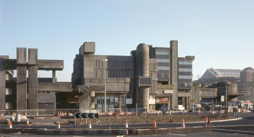
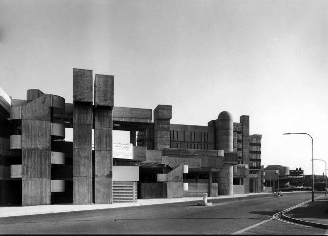
The designs were divisive and one such example was the Tricorn Centre in Portsmouth. The city was a target for German attacks as much as London due to its base for the Royal Navy being located there. The city was in desperate need of a cultural hub and the brutalism design of Luder and Gordon was deemed the answer. It was built in the 1960’s at the height of the movement’s popularity. It was unveiled as a place to shop, relax and be entertained. It was the site of a supermarket and the first Virgin mega store but inside it failed to attract many large retailers so it became the place of the small trader and market stall holder. It was grey and colourless, the idea being that the people and the retailers would bring the colour and life with their signs but this was beyond the ability of the small traders.
On the outside literal cracks began to show. The wet Hampshire environment coupled with the Sea wind caused the building to discolour and require maintenance. It was consistently derided and called ugly. It was demolished in 2004 despite strong objections. As Jonathan Meades pointed out it was the equivalent of the Brutalism architectures Stonehenge or Lincoln cathedral.


