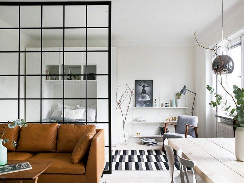
The lack of space is usually our daily bread in many homes. According to data , the average area of a house is 76-90 square meters. In cities this size is even smaller, where apartments of only 40 square meters are not uncommon. However, more than a real handicap, it is a matter of good design: in reality there is no small space – at least not in absolute terms – but badly organized. Taking advantage of the imagination and the infinite range of solutions offered by the market, we can take advantage of the available meters and make our tiny apartment the height of spaciousness and comfort. Here are ten infallible keys to achieve it.
01
SYNTHESIS EXERCISE
As we have just suggested, the size is relative: there are floors of 100 meters that look like a mousetrap because they are loaded with things. The important thing is that a space fulfills its function: contain the objects that surround us and accompany us. Doing a synthesis exercise about what we really need to live well should be the starting point to achieve a comfortable space. It is an emotional issue, but with clear repercussions in design and architecture.
02
BALANCED DISTRIBUTION
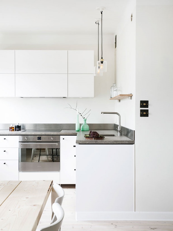
According to the Ylab study , in terms of spatial organization, it is important to define logical strategies: establish priorities, give more meters to the most relevant spaces, unify diverse uses in the same environment and propose furniture from the beginning. The final distribution must be balanced and breathe. “The essential thing is to start from a strong concept of design and apply it consistently,” they conclude.
03
FURNITURE, FEW AND LARGE
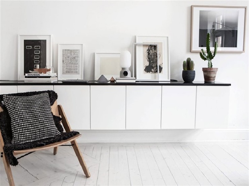
When you have a small space, you usually think that, logically, it would be advisable to use furniture that is also small. On the other hand, what must really be reduced is the number and size of the furniture. Our brain is sensitive to distractions, and the more elements you perceive, even if they are small, the less space will appear. On the other hand, a sufficiently large and continuous furniture that avoids visual noise – like the sideboard of the lower image, the same color as the wall – will give a feeling of greater amplitude.
04
MODULAR OR CUSTOMIZED?
A priori, and although it is more expensive, custom design seems the best solution to get the most out of the available meters and achieve a better integration of furniture in space, especially if it has a complicated geometry: inclined roofs, setbacks , closed corners … But in rooms of conventional forms, the modular series offer a more economical and effective alternative thanks to the flexibility that allows the combination of elements of different sizes.
05
THINK VERTICAL
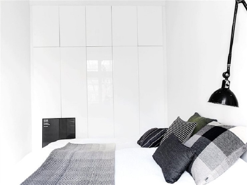
Although we manage square meters, in reality the space we occupy is three-dimensional, so it’s time to become familiar with the cubic meters. Double heights are a proven resource when the room has a sufficient height (minimum 3.5 m); for example, to create an attic like the one in the lower image, in which a bedroom can be located, a room where the minimum regulatory height of 2.5 m is not necessary. 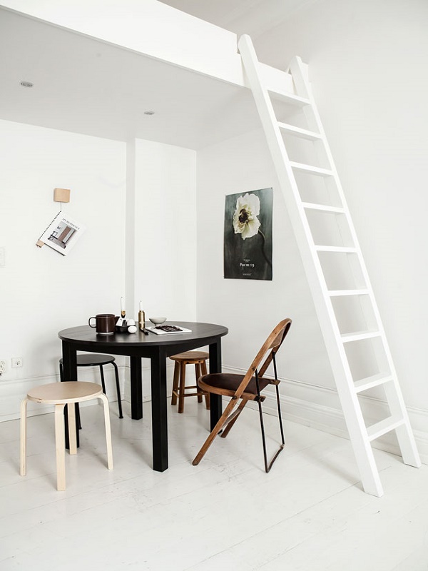
06
BREAK DOWN BARRIERS
The suppression of internal partitions to unify spaces operates in a double sense: on the one hand, it helps natural light to reach all corners; on the other, it eliminates dead zones and increases the sense of perspective, unusual in small environments. And if it is a question of zoning, there are soft solutions , such as the piece that separates the living room from the bedroom in the opening image of the article, that do not detract from the diaphanous character of a space.
07
THE MULTIPLYING POWER OF NATURAL LIGHT
The sense of spaciousness is directly related to natural light. The fewer walls and more windows, the better. The materials are also powerful amplifiers of light, so fleeing from dark finishes is essential so that the decoration plays in our favor and gives us more light. 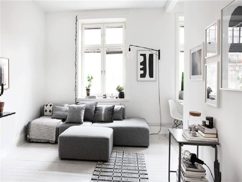
08
ILLUMINATE WITH SUCCESS
Like natural light, artificial lighting plays a fundamental role in the perception of the dimensions of a space. A bad lighting project can ruin the best distribution generating shadow areas or creating a “flat” lighting that eliminates the sensation of volume. As a general rule, the lights that are projected from the ceiling raise the look upwards, which provides a sensation of height. As for the lamps, if the lack of meters is pressing the best thing is to forget about the standing models and bet on spotlights, ceiling lights, wall lights and desk luminaires.
09
COLOR CHANGES EVERYTHING
There are colors that multiply the amplitude effect of natural light. First, obviously, the white, followed by neutral tones such as creams, toasted, gray or beige. The color in the painting is also a tool to play with the depth and perspective of a space. To make an elongated room seem more square, it is recommended to paint the back wall of a warm color, while painting the ceiling a lighter color than that of the walls will make the room seem higher. 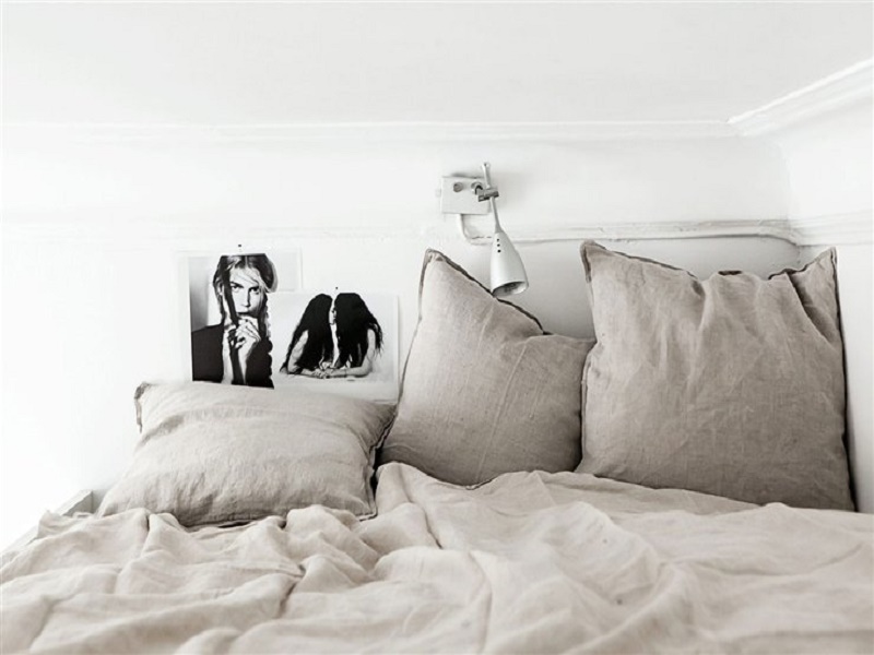
10
FLEXIBILITY FIRST OF ALL
A small space requires thinking differently. There is nothing more frustrating than trying to fit a standard home into a 40-meter floor. For this reason, architects and interior designers are betting more and more on original solutions, especially moving parts such as walls and retractable furniture to overlap functions in the same space. “Every time we have more things and we have to find a place in the house so that they do not disturb and, at the same time, they are accessible,” they say from the elii studio .

